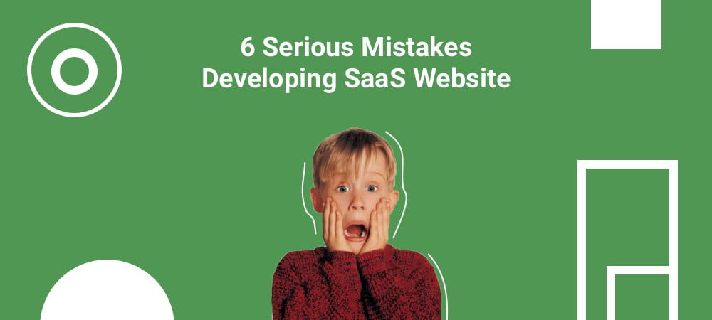
Short description of the article
Intro
Text instead of pictures in Saas Company Website.
Minor Visualization Saas Company
Content is too much technical
Exalted and unclear selling point
Highlighting only specific elements instead of advantages and strengths
Avoiding a possibility to test it with no charge
Conclusion
Intro
It is a common thing for SaaS companies to deal with a certain set of various concerns in the process of enhancing and improving markets' positions. For example, holding the amount of clients, being outlined against business rivals and increasing the number of new consumers and investors for their products.
Some workarounds of these troubles are contained in the website of SaaS organization. Why? Because the main page of your website is the first thing your consumer will see during the acquaintance with your organization.
Also read our article: Simple start to Angular 6 project with Ng-Bootstrap and SASS].
In your website with the help of various modern tools you are able to introduce yourself as an organization worth trust. Try to interact with the consumers by offering them some interesting and intriguing information, submerge them into the atmosphere of trust and cooperation in order to present them your product in a way they believe it should be bought, make them delighted by providing them with some support section on your website etc.
In case the organization has some strategic troubles with gaining a number of consumers and preventing their abandonment, it is possible that the first reason is badly organized website. You ought to renew it and supply with some tools that may help to deal with such troubles.
In order to simplify the process, we have investigated a huge set of examples of websites created with SaaS technology and prepared the set of fails that are rather popular among the developers and usually are on the websites of various organizations.
1. Text instead of pictures in Saas Company Website

In case your website has a big text product description with quite tiny pictures, you are in trouble. Actually, it is almost the worst fail if it’s implemented on your website.
The main rule is that the biggest amount of media support you have on your webpage the more attractive it is for the viewers and your potential future consumers.
Nowadays, the great emphasis is put on the User Interface and User Experience. This fact makes it obligatory for you to present and demonstrate your product on your web platform with a lot of video, pictures and so on. Nevertheless, keep it in mind that the media you use must be strictly connected with supportive text around it.
Be aware that using undigested combination of text and media may not attract a viewer. Moreover, it may lead to an opposite effect. The same situation with small pictures without a possibility to see some tiny parts of it.
Here is a small piece of advice, all media elements you use on your web platform must simplify the communication with viewer and help him to perceive all the information that your text contains. For example, in case you describe some design characteristic you should support the text with some media item in order to show its image to a viewer.
The really cool illustration of media and text cooperation is the website of Invision.
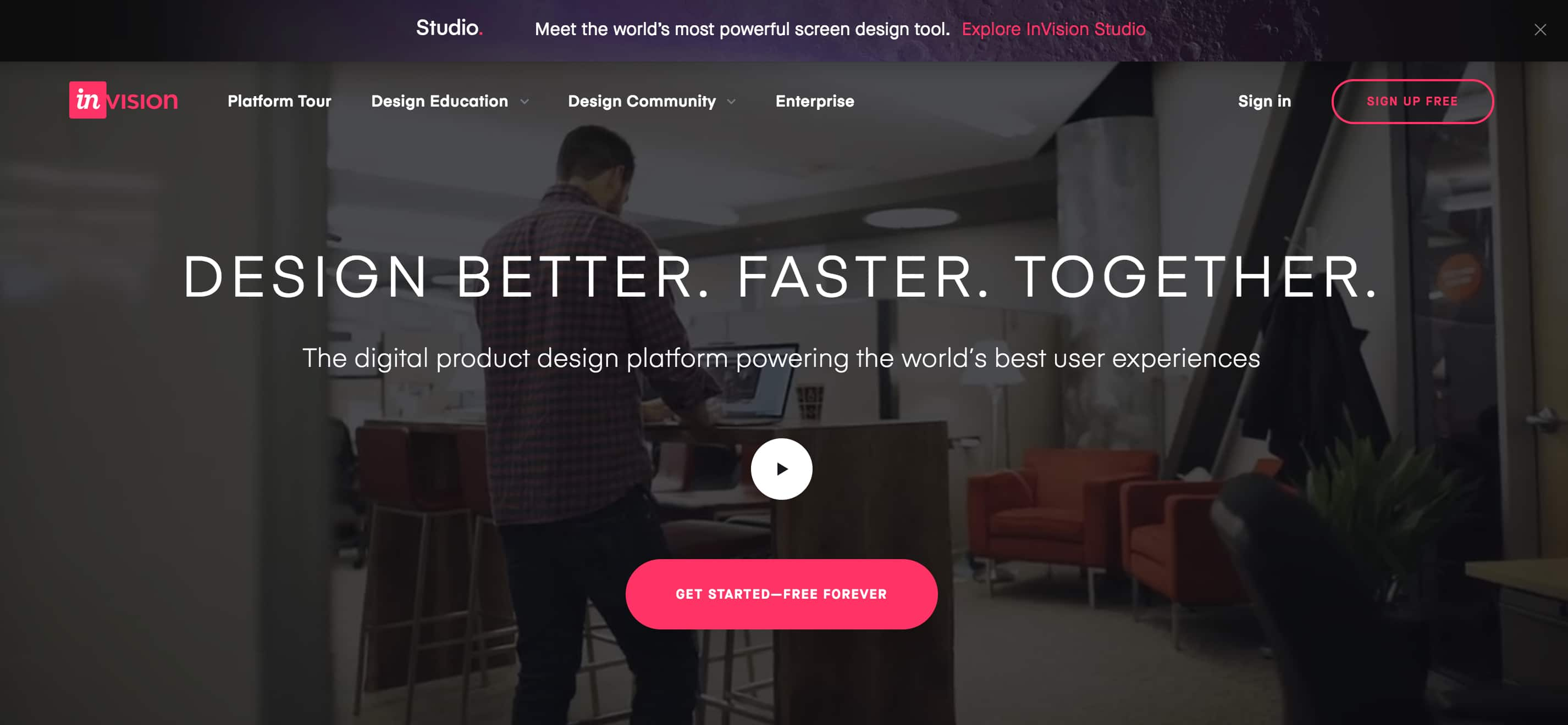
See and remember how this company mixes short and rather descriptive text pieces with various detailed pictures and screenshots. By using such approach you can provide clear understanding of your product and increase the possibility of viewer to support and use it.
2. Minor Visualization Saas Company

After finishing the development of your website check whether the media support of your content was prepared in strict accordance with the interest of your consumers. Try to fill your platform with pictures that clearly present the advantages of your product. Highlight the popularity and market demand of your product. Each media item should be picked up for some reason.
Also read our article: Top 5 Things about Mobile App Development NDA [2018].
3. Content is too much technical
Spending entire days within an atmosphere of technical development may be the reason you simply won’t remember to change the lexis list you use to sell your products to a consumer who mainly is a real person and do not share your adore to technical terminology. In case you work in such industry as SaaS it doesn’t mean you may use the common in your circle lexis in your website content. Otherwise, such usage usually cause bad responses from most of the consumers.
Try to fill your content with words and phrases that will influence the emotional part of your potential consumers, that will create an image in their mind which will help to remember your brand as an extraordinary one. Do not use any specific phrases or vernacular because it may bewilder users. Moreover, always check if your website information is short enough to be entirely perceived and informative enough in order to deliver all your intentions and thoughts.
Do not use enormous and large text passages because they may be the reason of reducing the understandability of your website.
Mint’s website is quite good illustration of preparing their content in accordance with consumers' needs. In case you visit their website you will see user-friendly interface with common lexis instead of specific vernacular.
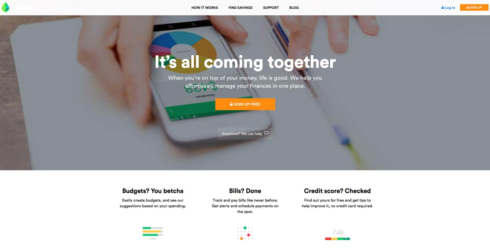
Their highlight various approaches they use in order to deal with different issues. Another feature is the usage of a few-column separation of the text in order to simplify its perception.
4. Exalted and unclear selling point

Usually, the peak of persons' concentration lasts about 8 seconds. You have only this period of time to make the first impression, to deliver to his/her mind all you want and leave there an idea to return to your brand. In our reality this is not a huge amount of time. That is why it is vital and extremely necessary to have professionally created and prepared price list on your website.
There are many websites that fill their content with non superfluous phrases and vernacular in the price list. Usually you may read it for several times but you won’t clearly understand what they are intended for. Read this illustration:
“Extremely modern approaches to enhance and aggregate the service of online marketing in order to increase sale rates through developing the conversion.”
Brain can be literally exploded.
This example is vital, full of vernacular and does not describe what exactly is comprised in the proposition. In order to help you avoid in future such fails it’s better to become familiar with 3 pieces of advice given by Neil Patel, of Quick Sprout.
They may be described as:
Annihilate all non superfluous things. Delete unnecessary word constructions.
Make your proposition as quick as possible. Try to make your proposition short, clear and quick. In case it takes users’ interest you will have a lot of time to make a consumer sure he/she made a right choice.
Include subtitles into your text to highlight the excellence of your product. After you catch consumers attention you get enough time period in order to show why your product is better than others and highlight its extraordinary features.
5. Highlighting only specific elements instead of advantages and strengths

Try to fill your website with information about advantages and strengths of your product and do not use too much technical description. Keeping emphasis on such things may influence the consumers much effectively and stay in her/his mind by appealing to their emotions and feelings. Access and storage with no limit, no time frames! – almost all your opponents may use such slogans!
Nevertheless, in real life they are too abstract and do not offer anything certain and, moreover, special to the viewers. They do not describe how it is possible to deal with troubles and simplify your life with their help. Try to create such slogan using a rule “One slogan = one decision”.
6. Avoiding a possibility to test it with no charge

Excluding a possibility to test your product without any charge before buying is the uttermost fails you may do but should avoid.
Despite your platform is fully-packed with media support items the viewers still may wonder if it works in a good way. For that reason, in order to make them sure that your product is necessary for them and can supply their success. In case you provide your potential consumers with an opportunity to test your product they will have a real evidence that your product worth investing. Moreover, they will be full of pleasure and confidence, because of opportunity to try in reality what they are going to buy. Such approach will definitely kill all the possible doubts.
UxPin is the organization with a title of good illustration of using such tool.
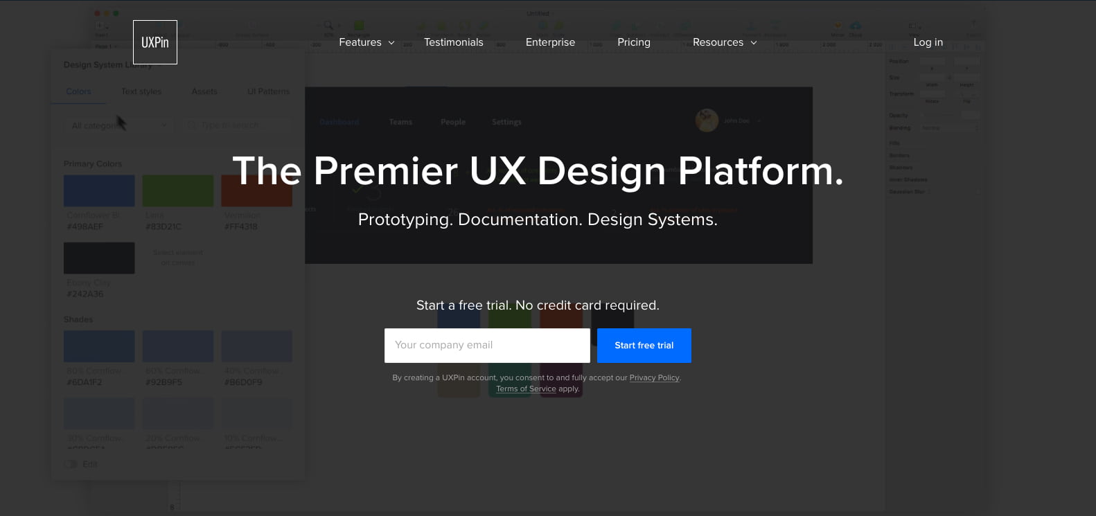
Once you have entered the main page of their website, you are immediately offered an opportunity to use it with no charge for a small period of time in order to make first acquaintance. Moreover, it is quite convenient to make such proposition just after a viewer have opened your website. As a result, you have only to confirm and fill up one small form and start testing.
How Does Your SAAS Site Stack Up?
Have you noticed any of such fails in your web platform? By fixing all of them and preparing your site to be used effectively you will increase its popularity and effectiveness in the aspect of consumer gaining. So, be aware of all these fails and fill your platform with easy-to-understand content supported by clear, relevantly added and bright media item that will enhance its perception features. Moreover, do not forget to highlight your strengths and benefits!
Conclusion
In case the organization has some strategic troubles with gaining a number of consumers and preventing their abandonment, it is possible that the first reason is badly organized website. You ought to renew it and supply with some tools that may help to deal with such troubles.
In order to simplify the process, we have investigated a huge set of examples of websites created with SaaS technology and prepared the set of fails that are rather popular among the developers and usually are on the websites of various organizations.
Among most popular mistakes are placing the text instead of pictures in Saas company website, content is too much technical, exalted and unclear selling point, highlighting only specific elements instead of advantages and strengths and the last but not least, avoiding a possibility to test it with no charge.
In case, you got left any questions or suggestions, feel free to contact us and we will assist you in any inquiry!


