A business's website or mobile app has the ability to leave a lasting impression on a customer -- and whether that impression is good or bad can depend on a lot of factors.
Because of web and mobile's potential impact, entrepreneurs have started to spend time and resources on improving user experience (UX). So how can you improve the UX of your website or mobile app?
What Is UX Design?
UX design focuses on the experience your customers have using your product. The "product" extends beyond the tangible good or service you're selling - it includes the content you create to reach and interact with your customers before they've even touched your merchandise. When developing a website with the user experience in mind, the goal is to escort your visitors through your business in a way that shows them exactly what you want them to see and understand at specific points in the buying process.
When tackling the user experience of a physical product, the goal is to offer a unique solution that corresponds with the need your user has in that moment. The product can then offer a new solution as the user's need changes.
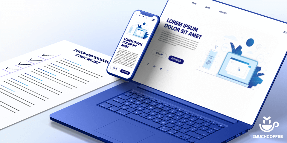
UX Checklist For Creating Websites and Applications
What do you do when you have tasks that you do again and again? How do you make sure that you do them correctly each time? One good solution, as it has been proven in many different fields, is to use checklists.
In a software agency, like 2muchcoffee, projects have repeating deliverables and user experience is what we primarily focus on optimizing during the whole duration of the project. So we created a user experience checklist that we use internally.
It consists of 6 main phases: Discover, Plan, Explore, Create, Finalize, Analyze. In the following part, we’ll go through the steps of each of them.
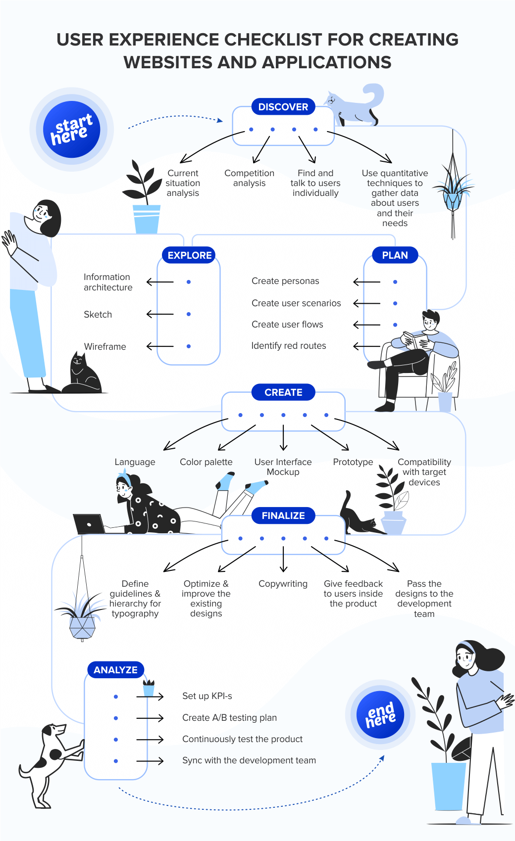
1. DISCOVER
Current situation analysis — If the product is the continuation of the previous one, gather and interpret existing data from tools like analytics software. Use usability testing to gather more information about what can be improved on an existing product.
Competition analysis — Take a look at similar products which already exist on the market and are successful. Take notes of what works for them.
Find and talk to users individually — Try to find 5–12 relevant persons to interview. Gather their feedback by carefully preparing a script and asking open-ended questions. This is a qualitative technique and is more intensive and smaller scale.
Use quantitative techniques to gather data about users and their needs — Do higher-volume research, and use tools like online surveys, landing pages etc.
2. PLAN
Create personas — After learning about users, create personas by using the phrase “User is a ____ who wants to ______”. Find a matching picture to identify and empathize with each persona. Personas give an answer about WHO is the product for.
Create user scenarios — After identifying users, write down a sequence of events to match them with their objectives and goals. User scenarios answer a question about WHAT is the product about.
Create user flows — By using the scenarios, describe through diagrams the user’s journey when interacting with the product. User flows answer a question about HOW will product work.
Identify red routes — Red routes are the key activities that people expect to be able to complete with the system: these are the reasons why people have purchased it. Defining them helps us avoid obstacles on key user journeys. If the red routes aren’t obstacle-free, it will be hard to convince users to continue using the system.
3. EXPLORE
Information architecture — Organize, structure, and label content to help users find information and complete tasks.
Sketch — Use pen and paper to quickly visualize your ideas. Do as many variations as you like. Take a picture with your phone to share with others if needed. Use sketches to get very basic concepts done and to brainstorm the ideas with clients and teammates.
Wireframe — Refine the concept further by creating pixelated grayscale designs. They represent skeletal frameworks of a product and are minimally detailed. Use tools like Sketch or Balsamiq.
4. CREATE
Language — Think about branding, user’s culture and context in which the product is to be used.
Color palette — The fastest way to create a good color scheme is to add colors by starting with one of the predefined, traditional color schemes and then work out from there. Use tools like Adobe Kuler.
User Interface Mockup — Create and refine visual elements and content. Reuse elements and patterns to create UI. Create guidelines and keep the UI elements consistent throughout the project.
Prototype — Choose mockups and their specific parts and add layers of interaction by linking them through. To create clickable mockups use tools like InVision or technologies like HTML/CSS.
Compatibility with target devices — If the product is to be used on a mobile phone define how are gestures handled. Work on responsiveness and behavior on devices like smart-watches, big TV-s, etc.
5. FINALIZE
Define guidelines & hierarchy for typography — Use a limited number of fonts on a page and make sure they complement each other. Consider what message they communicate. The 12-point font is most often the sweet spot for human readability.
Optimize & improve the existing designs — If there are any alternatives to consider, now it’s the time to do so. Finalize the designs and make them presentable to customers.
Copywriting — Optimize the wording throughout the project.
Give feedback to users inside the product — Show a loader when a user needs to wait and errors if something went wrong, give feedback of successful user’s actions, etc.
Pass the designs to the development team — Along with documents and specs to have everything ready to be turned into code.
6. ANALYZE
Set up KPI-s — Based on the project goals, define key performance indicators to track for the product.
Create A/B testing plan — Make a short roadmap of possible improvements and changes that can be made on the product.
Continuously test the product — Observe and learn with usability testing, A/B tests, surveys, etc.
Sync with the development team — Talk and inform the development team about the performance indicators changes and test results and decide on the changes to be made.
How to Quickly Improve User Experience?
There’s a reason we come back to the same grocery store each week. It’s the same reason that we return to the same barber, home improvement store, or favorite restaurant. These businesses have created a positive experience, which in turn creates loyalty toward their particular brand.
In the retail world, brand experience and engagement are the strongest drivers of loyalty, and the digital world is no different. Design, atmosphere, speed, and problem resolution are all pillars of a great consumer experience, and these same concepts contribute to their digital experience as well.
A great user experience on your site ensures that your visitors can find everything they’re looking for with ease and speed. It’s up to you to create a content-rich, meaningfully designed site that keeps your customers and partners engaged and returning for more. There’s a lot to say about how to better UX in every aspect of an organization, but the quick tips below will help you avoid common UX mistakes on your website, and instead, create a site that’s easy to use and provides an engaging experience for the visitor.
Speed
Optimize images: Speed matters. Every fraction of a second a visitor waits for your site to load, their frustration grows—and that frustration is aimed at your brand. Images account for a significant portion of that load time. Make sure you’re not making your visitors download a gigantic image that’s only being used as a tiny thumbnail. A website set up properly on a CMS will do this automatically for you, but if that’s not the case, there are plenty of free tools available that you can use to optimize your images before adding them to the site (JPEGmini, Smush.it, etc.).
Automate speed improvements: Set up as many automated speed improvements as you can. If you use a CMS, install a plugin that will cache parts of your site so that visitors don’t need to download anything more than once. WP Super Cache or W3 Total Cache are great if you use WordPress. These plugins can also minify and compress files, making file sizes significantly smaller and allowing visitors to browse your site more quickly. Some of the more technical aspects of caching and compressing files may require a web development partner.
Design
Avoid stock photos: Cheesy stock photography is the quickest way to turn a great site into a mediocre one. The typical user can spot a stock photo from a mile away, and it instantly devalues your website. If you’re looking for a photo to use on your “Contact Us” page, try a picture of your actual team rather than using the same stock photo of a woman wearing a headset that every one of your competitors uses.
Protect your brand: So you ran an A/B test and found that the garish neon green button converts better than the on-brand accent blue used consistently throughout your site. Is a 1 percent increase in conversions really worth the damage that eyesore will do to your brand? A/B testing is great, but keep in mind that the design affects more than what people click—it affects how they think about your company.
General
Be clear: Find a way to distill what your business does down to a clear, concise statement, and lead with that. There’s a time and place for mystery and intrigue, but the main headline of a business website is not it. Visitors shouldn’t have to read the entire site to figure out what your business does; they should be able to understand what you do within a couple seconds of landing on your homepage. A few well-written pages will be infinitely more effective than dozens of poorly-written ones.
Well-placed calls to action: Tests have shown that a call-to-action button performs best at the point in the page where the visitor also finds the information they need. Rather than plastering calls-to-action throughout the site and bombarding visitors at every turn, use a more strategic approach and place the button at the point where the visitor is prepared to make a decision.
Oftentimes, we get so caught up in ensuring that our websites appear in relevant searches that we forget how important it is to ensure that once customers and partners do arrive at our website, we are giving them the best possible experience. These tips should get you on your way.
Conclusion
Reducing the costs of business operations and increasing revenues is one of the key elements in the strategies of companies in the B2C segment. As a specialist, you verify the emotions that can be and are evoked within the customer in the process of purchasing your products, how the customer remembers this process and whether they are likely to recommend you to others based on their experience.
Ready to work on your website or mobile app, but still have questions about UX? Drop us a line and we gladly answer all of your questions!


