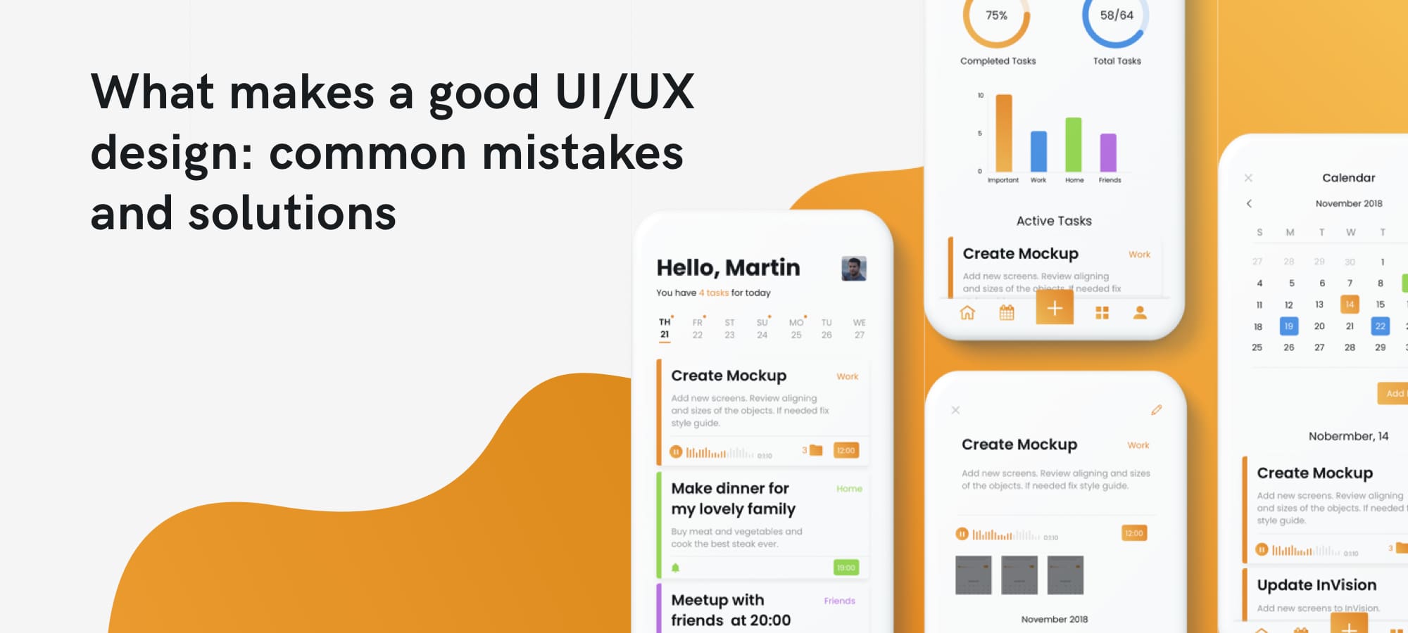
Short description of the article
Intro
General problems
Visual/content overload
Non-predictable elements
Incredible design vs. low performance
Non-optimized form
Poor navigation
Non-responsive website
Aesthetic issues
Unreadable typography
Wrong images
Thrilling or pale colors
Conclusion: So how to create a good UI/UX design?
Intro
Business owners who are ready to build new projects that based on great ideas surely invest a lot of time and money into app development, marketing strategy and ads.
But not many of them realize that another crutial element that needs to properly think through is design. There was a lot of startups that failed not because their project was bad, but because the performance of the app was quite poor. It doesn’t matter whether you create a mobile app or a website, the beautiful and simple design enhances user engagement while the bad design create negative perception towards the app.
In this article we are going to tell you how to avoid mistakes in the UI/UX design. In order to frame the further discussion, let's clarify what does the UI/UX design mean? Thus, UI is a user interface, and UX stands for user experience. All visual components the user is interacting with: the typography, images etc. belong to UI. To UX belong the analytical part of the designer work, research, the target audience definition, competitor analysis, testing, creating user flow and user persona.
The appealing UI/UX design is focused on maximizing usability and getting a positive user experience. Its main purpose is to be user-friendly for making the user's interaction simple and efficient, in terms of accomplishing user goal. The process of the UI/UX creation is comprehensive because they are two sides of the same coin.
Firstly, you should learn and follow the steps of the app development. It’s not the design you start with. It’s defining your app’s goal, analysing your competitors and researching the target audience. More precise information on the steps for the mobile app development you find in the article Mobile application development: Top 9 steps to build your startup.
We are recognized as a top New York Mobile App Development Company on DesignRush
So why is the UI/UX design so important?
-
It increases your revenue and fosters interest in the website or the app, encourages to start using services or products. It doesn’t matter whether you are offering products or services, the users are more likely to try out using the well-designed app or website.
-
The well-design app converts users more effectively. The conversion is completing the desired goal by a visitor on your website.
-
The user-friendly app or website provokes interest and people repeatedly use it.
-
If you have an app with the bad design you may redesign it later, otherwise, your project fails. Nevertheless, in this case it’s a money and a time waste.
Maybe you have invented a great startup but the customers can’t discover your ideas because they are scared off with loud colors, content overload or low performance.
The users nowadays have so many options to choose from that they wouldn’t wade through your app in order to search for the relevant information.
If you are going to develop your app/website, you should know what the conversion depends on. And it’s the design that makes an important contribution to the conversion rate. Now it’s time to consider the mistakes in the design creation and tell how to solve them.
General problems
Visual/content overload
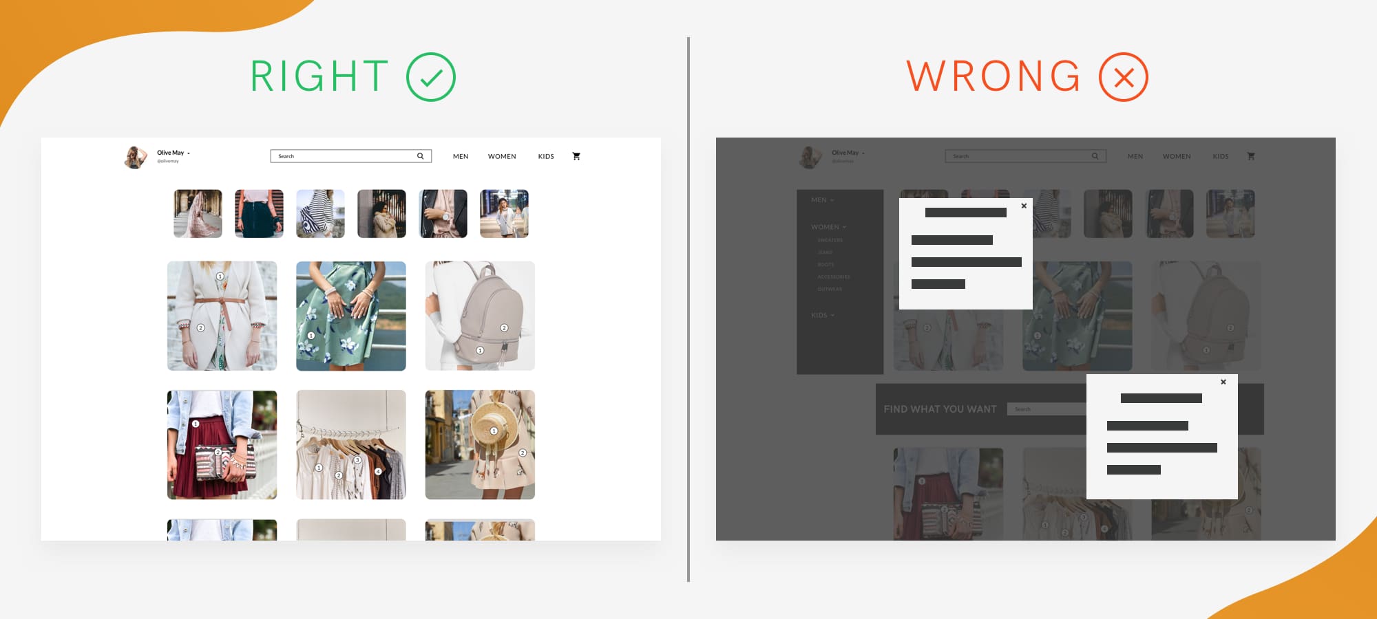
Many business owners want to include to their app as much information as possible. When we are trying to decrease loads of symbols vs. information vs. images in the homepage the client tells us: “Everything is very important”, and then he adds: “Besides, I want to include these links, one more pop up and 5 very important paragraphs of text!”
In our era of information overload, not many people know about the importance of the empty space in the app. The empty space is a white space between information blocks. If your app lacks “the white space” the users perceive information with great difficulty. And vice versa: if the empty space is properly placed the users structure the information more clearly.
The reading content should be optimized and the most important information should be highlighted. If the users can’t concentrate on the most important feature because of the visual or content overload, would they spend their time on the incomprehensible app or would they visit your competitors?
Pop-ups: they can be annoying. Especially if the users haven’t seen the content of the website yet and are suddenly interrupted with a pop-up.
The paradox of choice: if the users have to choose from too many options, they don’t choose a single one.
Fix:
Give the people some time for reading before they are interrupted with a pop up. Don’t create too many popups, 1-2 pop-ups will be enough, otherwise, you build a non-user-friendly website.
Keep your design as simple as possible. Look through the eyes of people who should be interested in your app, not scared off with a lot of UI elements.
Define what things are really important. What should be highlighted and quickly found by the customers and what is an unnecessary option?
You should decide the feature importance hierarchy and be ready to inform your designer about it.
So don’t add too many functions, options and items especially to the home page.
Remember to create calls-to-action statements: “Contact us!” “Read the book here” “Download the film right now” etc.
Non-predictable elements
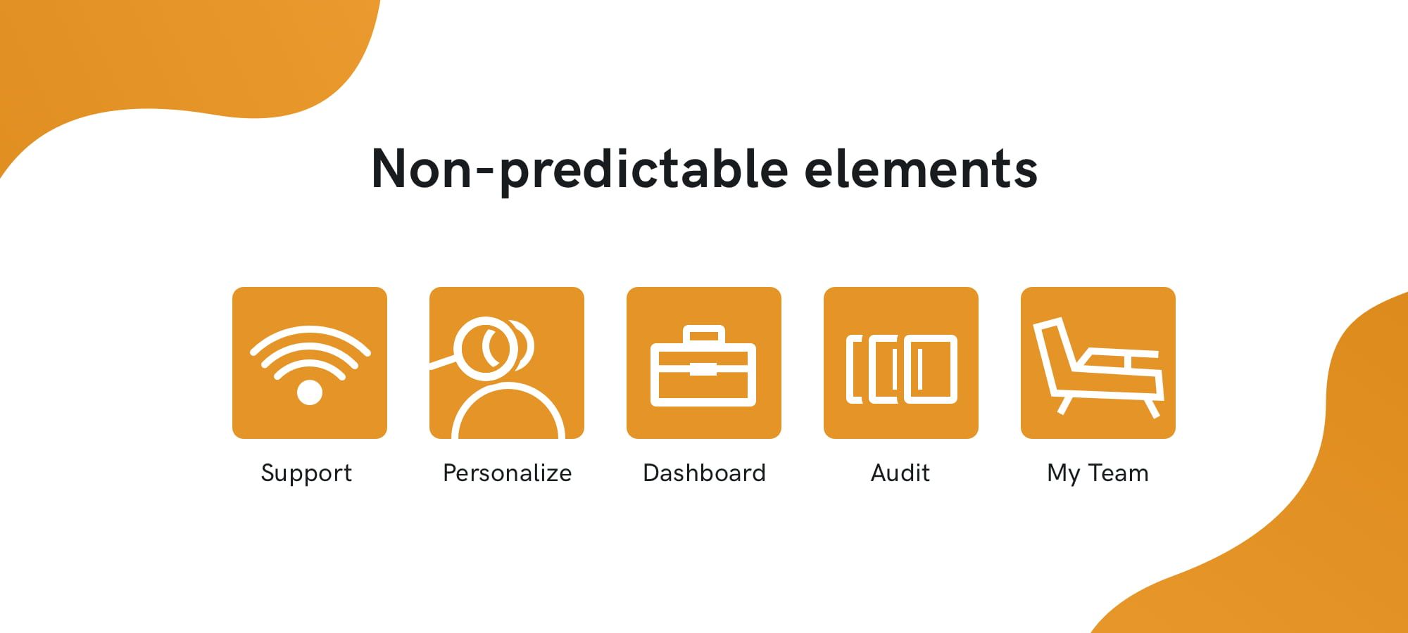
Sometimes you find symbols in the app/website which aren’t clear at all. Actually, it relates not only to symbols. There are buttons or other objects which designation are not clear. There are certain icons or buttons the users got used to seeing in certain places. If you didn’t create self-explanatory symbols and don’t give any hint what they are for the users get confused.
Another problem is changing the meaning of the well-known symbols. We don’t recommend to do it. For example, we created an e-commerce platform where the business owner wanted to seem original and unique. He planned to change all the usual symbols (shopping cart, search etc.) and replace them with his own symbols. Surely, it would distract users from their main goal - shopping that’s why the symbols weren’t changed.
Fix: Use well-known symbols and don’t change their meaning. If you want to add an unknown element, firstly, explain or give a hint when hovering a mouse on it. Collect feedback from users, who belong to your target audience and find out what icon disturbs or distracts them.
Incredible design vs. low performance
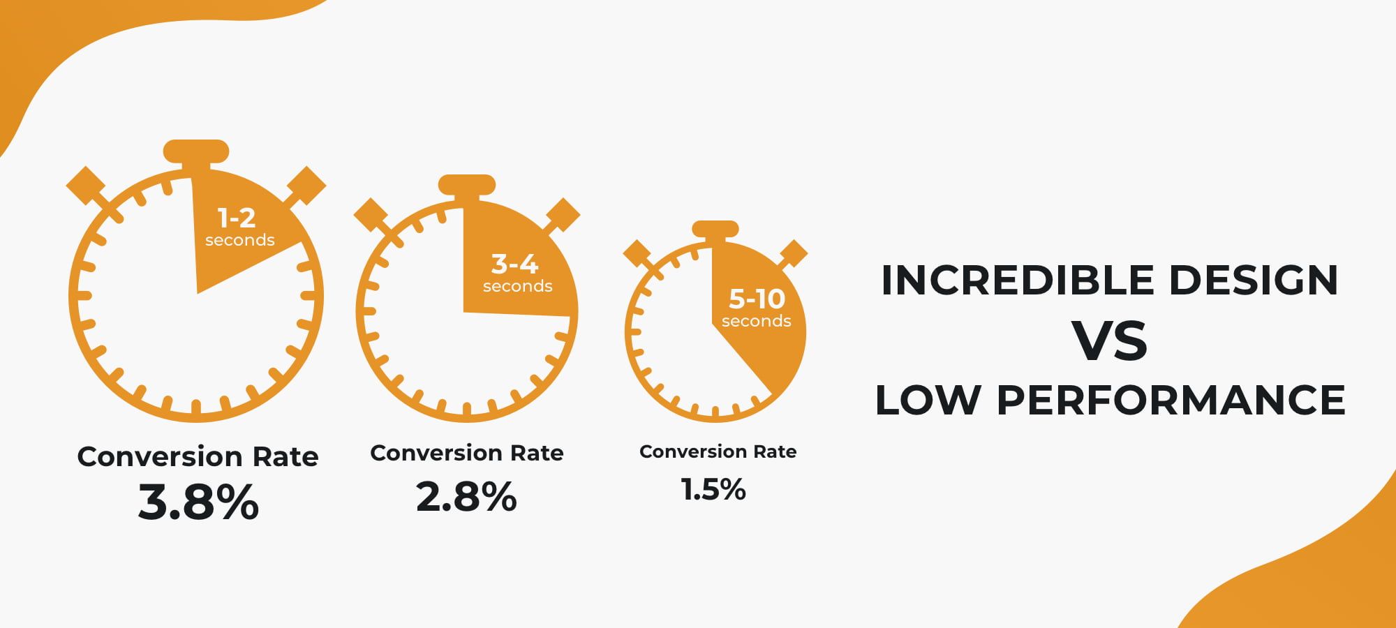
We understand that our clients want to make a very appealing UI/UX design. But you should be aware of the fact: there are elements in the design that slow loading time. And be sure - current customers aren’t ready to wait.
If you forsake performance trying to create an incredible design your users wouldn’t wait for it and just go to your competitor. There are many research results showing the more seconds the app/page loads the more users abandon it.
Look at the infographic How Loading Time Affects Your Bottom Line.
Fix: It’s very important the designer is communicating with the development team. If the designer creates a great design that slows the website load the team informs him about this issue. From this angle, the work of the company is gaining an advantage in front of freelance designers. Always take into account the responsiveness of the app/website with the certain design. If your wonderful design makes the app load very long, change it or it wouldn’t convert as many customers as it could be. A good designer wouldn’t blindly follow your ideas. He would inform you about the issues that may appear.
Non-optimized forms
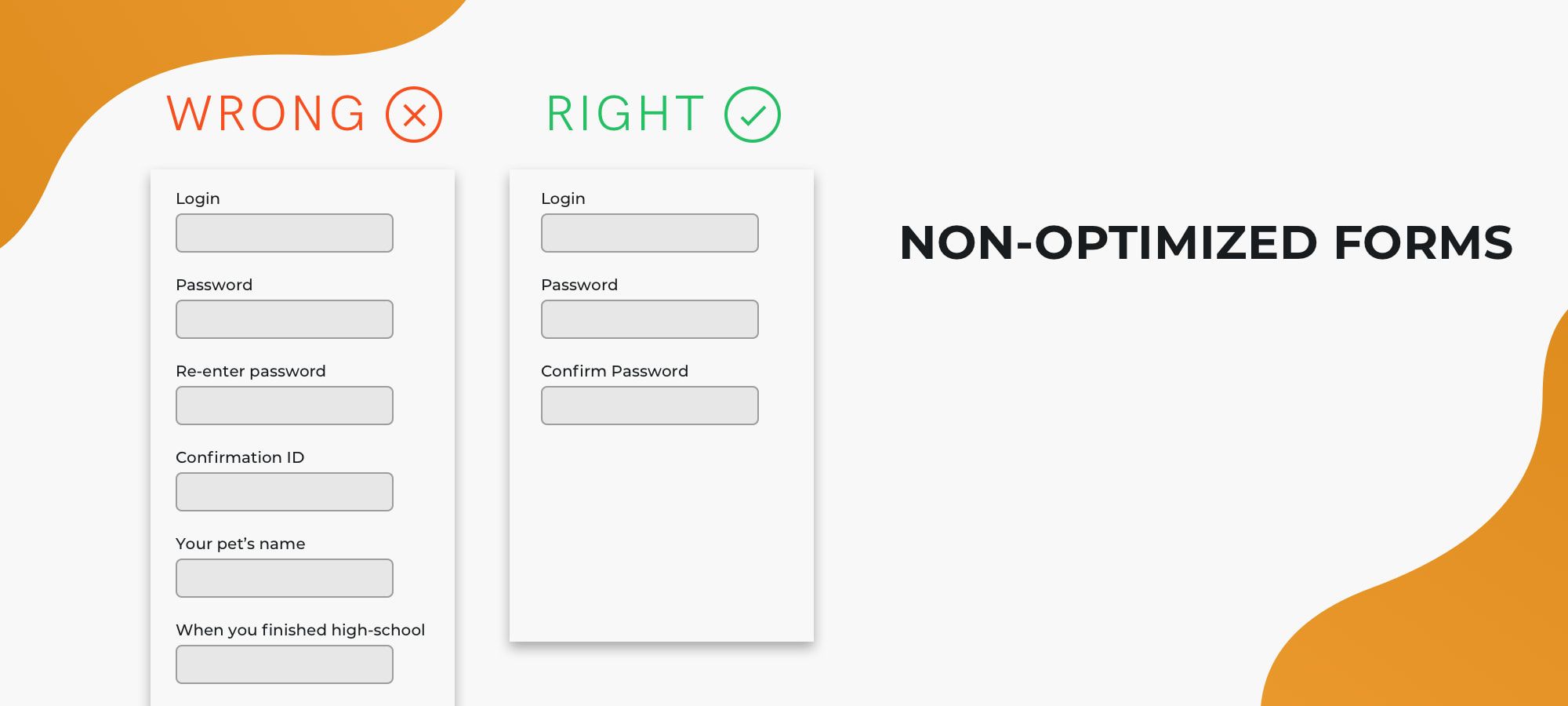
Everybody encountered the situation when he or she filled in the form and suddenly, there appeared an error and the information was removed. Isn’t it annoying? Of course, it is! Would the customers patiently enter their data again? Not all of them... So, how to avoid this problem?
Fix: If the form has restrictions, give a hint before the users waste their time entering information. Make additional explanations next to the form. You can give an example of the right filled-in form or a hint which appears when hovering a mouse on the form.
Long sign-up/sign-in process belongs to this problem. If your app comes with a long sign-in or sign-up form, before it offers good products it may offer “good frustration” to the users and create a negative user experience.
Sometimes the business owners create such long obligatory forms that users don’t fill in half of them and abandon the page.
Fix: Entering a website the users shouldn’t waste a lot of time searching for a login form. They shouldn’t waste half an hour filling in this form. Otherwise, the negative emotions would appear at the very beginning. One of the good solutions is signing in with social media. The users sign in very quickly and you may learn some information about them from their accounts. The second solution is creating a short login form (E-mail and password only) so that the users sign in very quickly.
Poor navigation
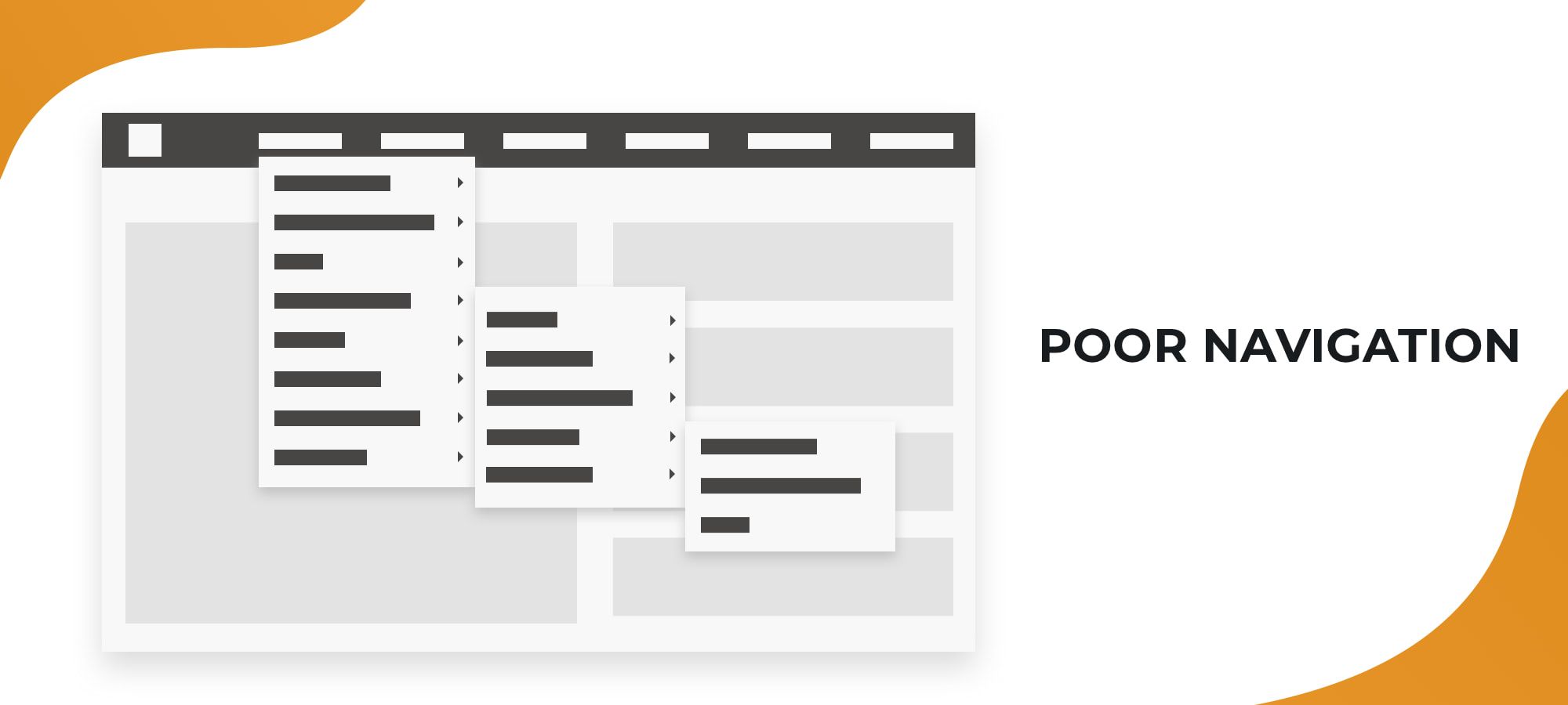
What do you know about the 3-click rule? It’s a design rule according to which the users can get to each page and find all needed info with no more than three mouse clicks. Additionally, it should be clear to the users, how they should find the necessary info. And now we have come to the next issue: the scheme of your app should be predictable and clear to the users. If they wade through your app they quickly lose interest.
Fix: You should know how your audience is using your app or website. In addition to it, you should create the user flow - the path the users would make on the website reaching their goal. The website or the app should meet the user’s needs and not prevent him to accomplish his tasks.
Non-responsive website
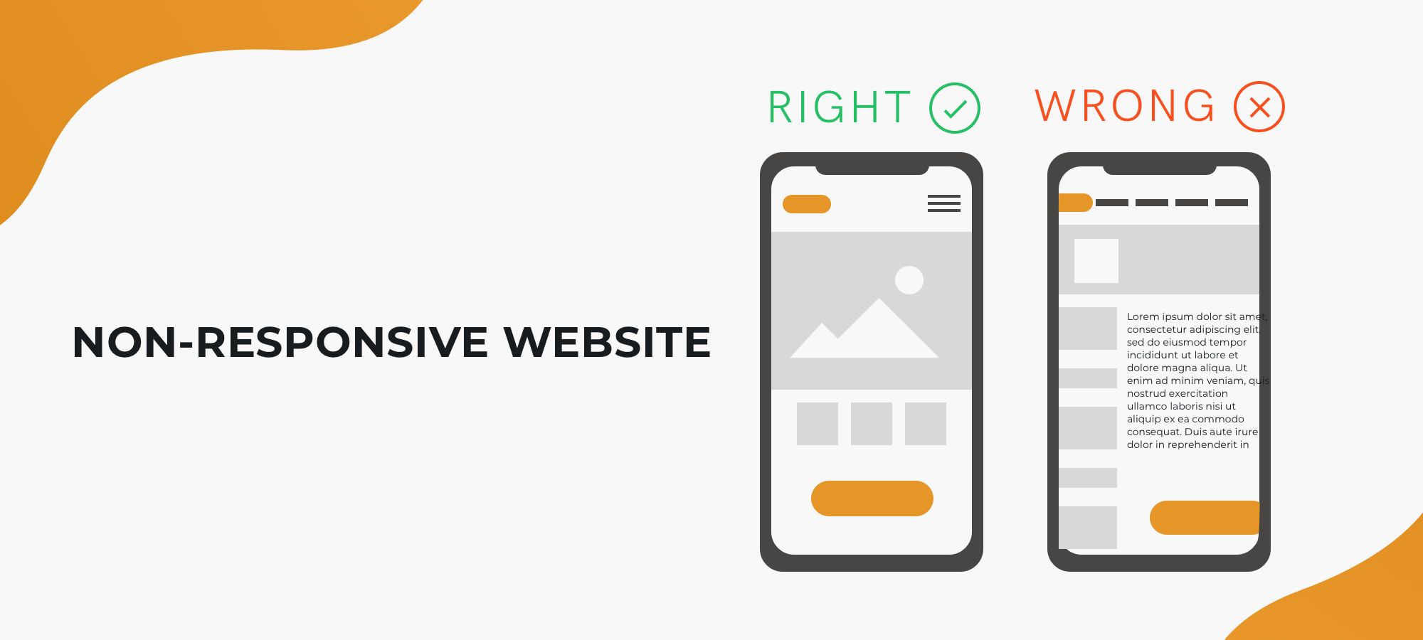
If talking about the web development you should not only pay attention to the desktop version of the website but to the mobile version, as well. Nowadays the users are more likely to access the website through their mobiles. You can’t imagine how many issues appear if the website isn’t developed with mobiles in mind: there are problems with the menu, the image and text size turn out to be inappropriate etc.
Fix: The message is clear: create a responsive website that would adapt to any mobile platform, otherwise, your website wouldn’t look absolutely unusable in the mobile version.
Aesthetic issues
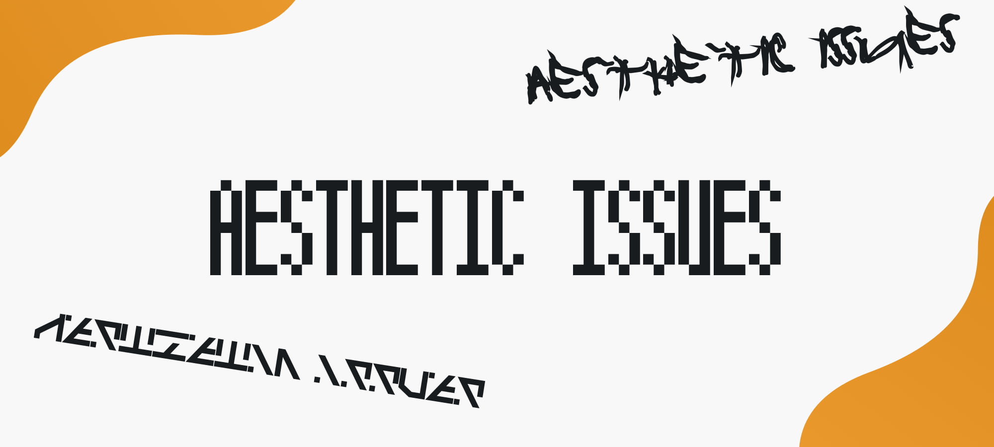
Unreadable typography
Sometimes the client wants to stand out with a new typeface on his project. So, he or she opts for very unreadable typography and is proud of his unusual app. This tendency can do a great disservice to the product. Remember: if the text doesn’t contrast with the background, the letters to run together, if the typefaces have extreme slants, if the letterforms are tight and condensed, with spirals and other strange elements they can look unreadable.
Fix: opt for more common typography, and consult your designer if you aren’t sure which style to choose. Choose readable typefaces for your app. You can use several typefaces: this helps to place the emphasis of the users on certain text blocks. But opting for several typefaces be careful: the inappropriately chosen font pair makes the content perception complicated.
Wrong images
Firstly, don’t take overused photos, images with poor quality, as well as images which aren’t appropriate in the context. Secondly, be wary of beautiful images which have unclear meaning in the context.
Fix: What is the main goal of the images? They should provide a positive user experience, inspire to make purchases or to use the app repeatedly. Don’t opt for the photo only because it’s funny and you like it. The image of the stylish woman is appropriate in the online store and the nice cats’ photo fits the pet clinic website. So you should choose appropriate images only.
Thrilling or pale colors
Do you know how to scare off your users? There are so many fantastic colors in this world, why not to use all of them in your app? Then it would look like a nice rainbow.
Fix: opt for a certain palette for your app or your website. Limit the palette to approximately 5 colors and shades. The colors shouldn’t be very pale or merge into one stain, the most important things should be highlighted: for example, the call-to-action buttons should have an eye-catching color but harmonize with the whole website.
We are recognized as a top E-Commerce Design & Development Company on DesignRush
Conclusion: So how to create a good UI/UX design?
The design should convert your customers and clients. It should create a positive experience. That’s why pay attention to creating an appealing design on the app/website so that the users would repeatedly visit it.
Find the right designer for your startup. If the same team is creating both website/app design and front-end, the designer has the opportunity to communicate with the development team and many issues are avoided (e.g. low performance because of the overloaded design).
The smart and creative designer can not only follow directions. He or she is a person who is about to correct your mistakes and tell you how the mobile app or a website would look better and more usable. He would give additional advice and prevent problems even if you have no clue they could exist.
UI and UX shouldn’t be considered separately because they are two sides of the same coin. Creation of the beautiful and appealing design is a comprehensive process. To conclude, it is essential to keep the design simple, clear, appealing and readable. Research your target audience and create the user flow. Find out what helps the users to accomplish their task and what distracts them.
Take into account the appealing colors, readable typefaces, the most important information only, quick sign-in and sign-up forms. If you are building a website remember to make a responsive one to avoid troubles in the future. Take into account that the minimal design is more appealing than the design overloaded with the content. Leaving the most important elements only you improve your app performance.
Got left any questions or suggestions, feel free to contact us and we will assist you in any inquiry!


