Have you ever wondered why the users don’t interact with your product the way you were expecting them to? The reason for this might be your elusive understanding of the basic user psychology. The principles that are driving customers for a specific action - to click, to download or to buy specific things. Generally speaking, each and every customer is driving by certain emotions when they are deciding whether they want to interact with a website and its product or not. Psychological instinct is a driving force behind the customer’s action. By this mean, they are trying to establish a direct connection with a brand and the idea behind it.
Psychology and graphic design are playing a crucial part in shaping those instincts and the willingness to interect further with the brand. In that case, psychology of design plays an essential role in building an effective and convenient user experience.
The following design psychology principles help you to create an engaging UX design for your new business to boost the user interaction with your website and consequently the digital presence of your product. Our team briefly discuss the most crucial points of the psychology of design in this article.
Hick’s Law
Have you noticed that the more options you have the more time you need to make a decision? Due to the fact, there is a direct connection between those two variables. Taking that into account, Hick’s Law is an inevitable part of the smart UX design.
According to Hick’s Law, the time it takes to make a decision depends on how many options are given. The smart incorporation of Hick’s law in design will allow scattering navigation items throughout the design in small clusters. This approach will help to narrow down huge volumes of information without overloading the user. That is why this law is a great solution to reduce the users’ stress while navigating the website and searching for the relevant information. As a result, it will encourag more quick actions and consequently increas conversions.
Miller’s Law
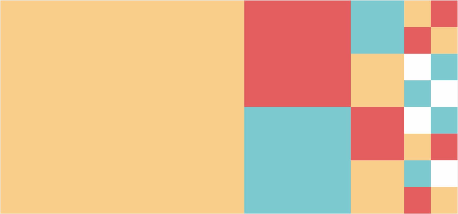
According to Miller’s Law, the average person can only keep about 7 (+/- 2) pieces of information in their memory. This is crucial to take into consideration while arranging the best way how to shape and transmit information to the users. While designing a website or a mobile app this law is essential to create great UX. Following this law, the content presents in more memorable and effective way while designers and developers decide how much to show users at one time.
For example, marketplace platforms can apply one smart strategy - chunking. Instead of showing users 30 items of goods on their web or mobile app, it is more logical to group them into 5 chunks. Therefore, it will be more convenient for users to keep in mind the groups of items which are relevant to them. Another great example of chunking is the Search option in Booking.com. The website filtering information in accordance with the appropriate searching options, like location, price, number of guests and rooms, etc.. This practice allows users to keep in mind only relevant information.
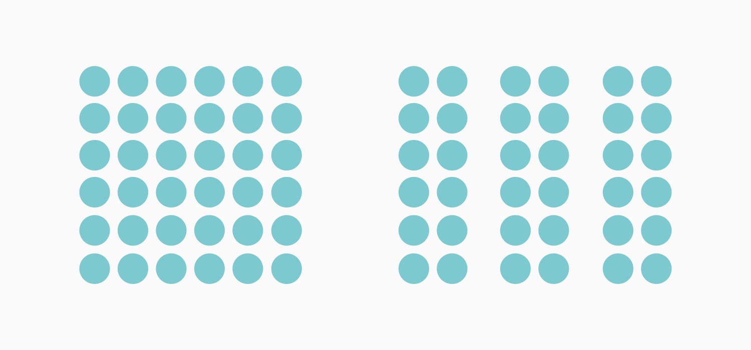
Gestalt Theory
The law stresses that people naturally tend to organize many smaller items into a larger group. That helps us proceed information more clearly while creating visual hierarchy and increasing the scannability of content.
The main principle of the theory consists of several categories, such as:
Symmetry: Symmetry is aesthetically pleasing for us so when people look at certain objects, they tend to see them as symmetrical shapes.
Proximity: elements that are placed close together are perceived as a group. Therefore, several distinct objects placed in close proximity are seen as one unit.
Similarity: similar objects that are placed in close proximity to each other are perceived as a single unit, too.
Figure and ground: users can switch between an object and its surrounding area that represents the ground to perceive different images.
Closure: although an object might be incomplete, our brains fill in the missing information to allow us to perceive it as a whole.
Continuity: the law of continuity is based on the creation of curved lines that allow the eye to flow with the line. It leads to the psychological phenomenon when the eye is encouraged to move through one object and continue to another one.
For example, websites or mobile apps that are using white space to shape information flow are actively using Gestalt theory. The homepage of Apple’s website is known for using the law of proximity. When on the white background there are the product name, logo, tagline and links to buy the product. Therefore, the philosophy of grouping surrounded by white space illustrates the best UX practice.
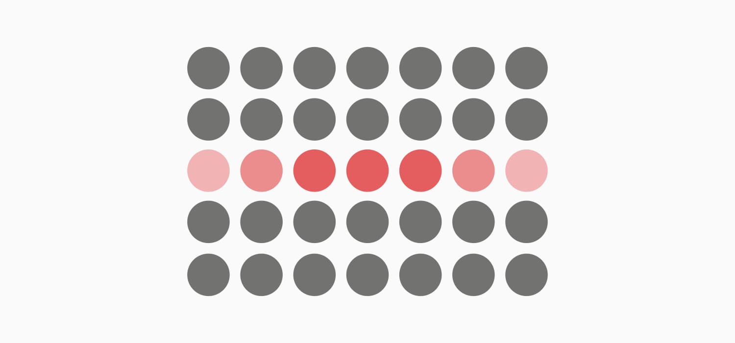
Von Restorff Effect/ the Isolation Effect
Have you noticed that among multiple similar items the one which is different from the rest is most likely to be noticed and remembered? This tendency might be explained by the Von Restorff effect. For UX design this effect is useful in order to stress the crucial pieces of information as well as encouraging users to do the specific action.
For example, it is better to chose a different color for a Call To Action button on the webpage. By this mean, it could stand out from the overall color palette of the rest of the page. This approach will draw user attention and encourage clicks which potentially could be generated into leads.
Psychology of Colors
Colors are something that influences our decision-making process on a daily basis. In that case, colors have a great impact on the users’ perception. That is why the psychology of colors is an essential tool of every designer to create great UX. Knowing the meaning of colors and to be able to incorporate that knowledge in practice will eventually motivate users to certain actions and shape the conversion of your product.
Here is the list of the basic colors and the meanings which they are typically associated with:
Red. The color usually associates with passionate, strong, or aggressive feelings. It symbolizes both good and bad feelings including love, confidence, passion, and anger. In design, the use of red color is an effective way to draw users’ attention.
Orange. It is an energetic and warm color bringing the feelings of excitement. Orange combines red’s power and yellow’s friendliness, so it may bring feelings of motivation, enthusiasm, and love to live. Designers use the color if they need to give the spirit of creativity and adventure.
Yellow. This is the color of happiness which symbolizes the sunlight, joy, and warmth. Users seeing yellow colors in the design can feel inspiration and confidence. Although, you need to remember that too much yellow may bring negative reactions such as the feeling of anxiety or fear.
Green. It’s often called the color of nature, balance, and harmony. Green brings calming and renewing feelings. Also, it is a sign of growth and inexperience. It has more positive energy than most other colors but sometimes it associates with materialism. Design in green colors perfectly suits the products connected with nature.
Blue. It often represents some corporate images since blue is the color of trust. It usually shows reliability, may give users calming feelings. However, as a cool color, it also associates with distance and sadness, so designers need to keep it in balance.
Purple. Long associated with royalty and wealth since many kings wore purple clothes, it’s useful for presenting some luxurious products. It’s also a color of mystery and magic. It mixes the energy of red and blue, so it has a balance of power and stability. A big concentration of the color may distract users’ mind.
Pink. It is the color of hope, sensitivity, and romance. Pink is much softer than red, so it creates a sense of unconditional love. Pink is associated very strongly with youthful femininity, so it may be an effective color if the target audience is mostly girls and young women.
Black. The color has a great number of meanings. It associates with tragic situations and death. It signifies a mystery. It can be traditional, modern, serious. Everything depends on how you employ it and which colors go with it. Black matches well with any other color, so it’s ideal for the background. Designers often use it to set contrasts.
White. The color means purity and innocence, as well as wholeness and clarity. White often associates with a blank sheet of paper motivating people to generate new ideas. However, too much white can cause feelings of isolation and emptiness. In design, white is commonly used as the background color especially for the resources for which readability is a vital part.
For example, both women and men favor blue, green and their tints in general. In addition, women prefer tints, while men prefer pure or shaded colors. There are a lot of similar details that the designers need to take into account while creating a web or mobile app.
Recognition Patterns
The whole website should be united with one theme and common patterns in their design for a smooth UX. While visiting a specific website the users are expecting to see a relevant design and information, rather than just colorful pictures. The design needs to be associated with the product and its concept.
However, not only the colors and pictures matter. Some obvious and common things such as a list of blog posts on the front page of a blog or the filters in the e-commerce website are also important for successful navigation. Users become accustomed to things quickly and their absence makes them feel uncomfortable.
Scanning Patterns
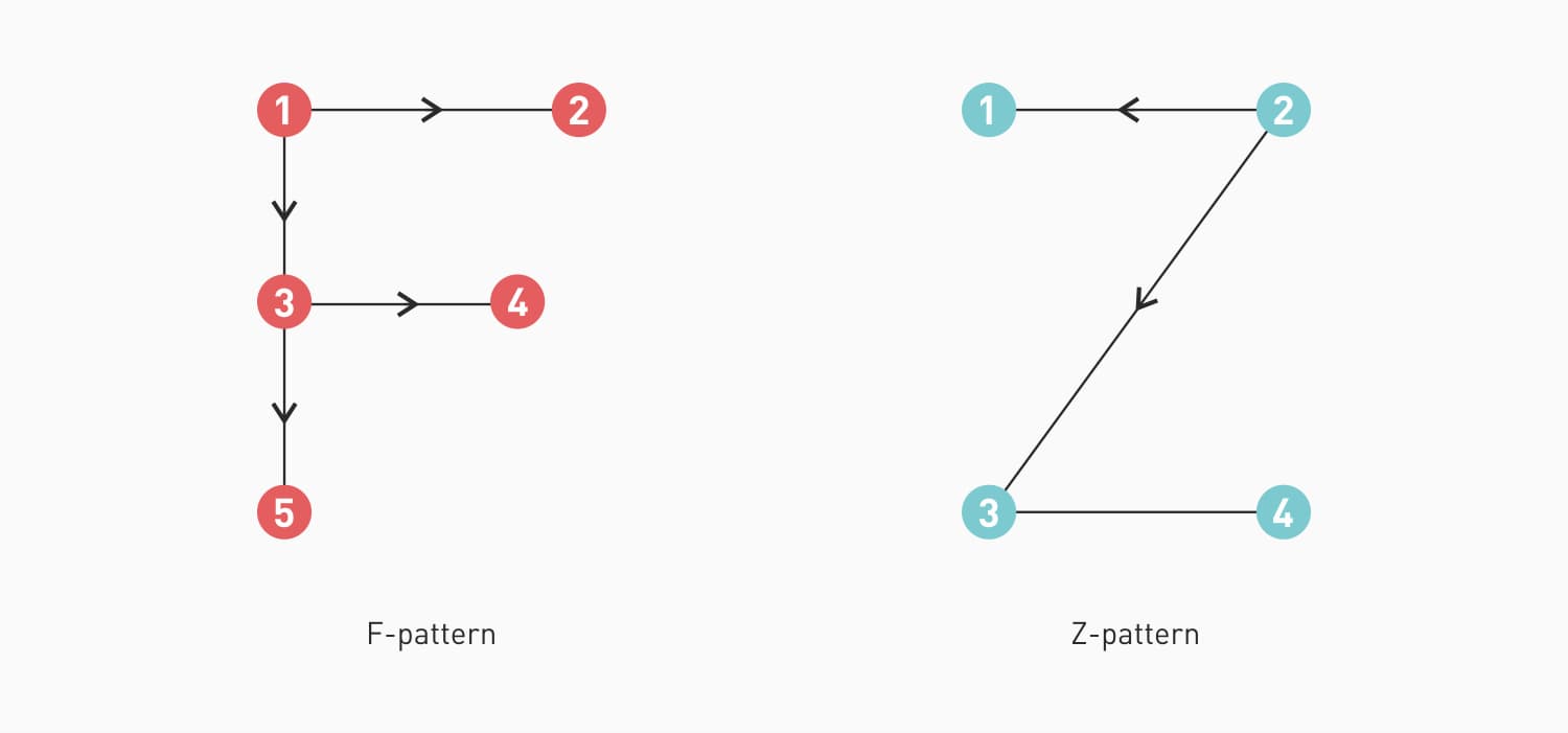
The modern world is the swirl of information, therefore users don’t read everything they see online. In that case, to make the digital product scanning or eye-tracking is essential. Actually, scannability is the way to present the content and navigation elements so they could stand out from the wide range of other similar products or services. There are F and Z scanning patterns that are widely used.
Therefore, F-pattern is referred to the situation when the user scans the first horizontal line on the top of the screen, then moves down the page and reads along the horizontal line which usually covers shorter areas of text. This approach is good for text-heavy pages such as blogs, news and magazines platforms, etc..
Another is the Z-pattern. In this case, the user reads the first top line while looking for useful information. Then he/she goes down to the opposite side of the page at a diagonal. It is a typical model for the landing pages or websites when they evaluate the relevance of the webpage and its products.
Knowing the scanning pattern developers and designers could place the elements in a more effective and convenient way for users to experience.
Conclusion
We discussed the top 7 psychology design principles. In fact, the combination of psychology and design is a powerful tool to build an effective and convenient UX design for your new business. Therefore, take a look at Hick’s Law, Miller’s Law, Gestalt Theory and the Isolation Effect. The mentioned laws will help designers to narrow down huge volumes of information, to present content in a more memorable way, to create a visual hierarchy of the content and to encourag users to do a specific action. In addition, do not neglect the psychology of colors to motivate users to further interaction with your product. For a smart placement of the relevant information, the best solution will be using Recognition and Scanning Patterns.
We hope the article was useful to you. As you can see, your business could benefit a lot from the smart implementation of the basic principles of psychology designs. In case, you've got any questions or suggestions, feel free to contact us and our team will gladly assist you in any inquiries!


