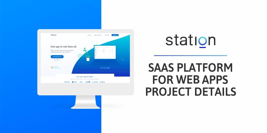
Station is the global SaaS platform and the web browser of the future. It was specifically designed for efficient work. One single and elegant app to rule your other web applications. Based in Paris, Station was elected Product of the Year 2017 on Product Hunt. Additionally, the team graduated from the YCombinator W18 batch. The startup was noted for its innovative idea and product - a workstation unifying within a single interface all of the applications you use at work.
SaaS platform. What does it mean?
Software as a Service (SaaS) is a part of the cloud service which enables easier access and storage of data. A majority of the SaaS applications run directly through the web browser, which means they do not need any downloads or installations on the client’s side. The meaning of the SaaS platform is to allow the access of an app via an Internet browser which is managed by a third-party vendor, to its users.
The main advantages of the SaaS platforms for the business are:
The data is stored in the safe place
Upgrades or downgrades can easily be done when necessary
Servers can be located around the world, which means if one of them goes down, the rest continues to work regular revenue for developers
SaaS provides lower development costs since there is no need to buy and maintain expensive hardware potentially larger customers base due to lower costs and trial periods
The solution is available at all times and is only limited to an internet connection
Station — a productivity app built on React and NodeJS
“A bus station is where a bus stops. A train station is where a train stops. On my desk, I have a work station….” ― William Faulkner
The quote of William Faulkner, an American writer, and Nobel Prize laureate, perfectly describes the state of our work lives. The work station is the place where we spend the predominant amount of hours on a daily basis. As a result, our work station should work for us and not against us.
Over the years, our browsers have evolved to become the central way of our lives. Working, shopping, reading, watching, writing, listening, sharing and much more. However, as the times go by, web browsers started to show some weaknesses since billions of people were shifting to the browser as their main work tool.
From the very beginning, the Station team was focused on easing the user’s experience during the workday. Station is a free desktop application that unifies all your work tools in one neat and productive interface. It is an alternative to your browser that's entirely dedicated to web apps you use at work, and that's designed to help you focus and get work done. The Station, available for both Mac and Windows, aims to ease the whole process of using apps while working. App provides the opportunity to have one app to centralize all of your work. Therefore, Station supports 600+ apps including G Suite, Slack, Asana, Trello, etc.
You’ll find below a showcase of Station:
The recipe for the Station's success is within its features.
Smart dock which helps you neatly organize all your work tools. Are you tired of switching tabs? The smart dock instantly cleans your desktop.
Focus by design eliminates any temptation to get distracted. Designed as a distraction-free platform, Station separates work from personal applications.
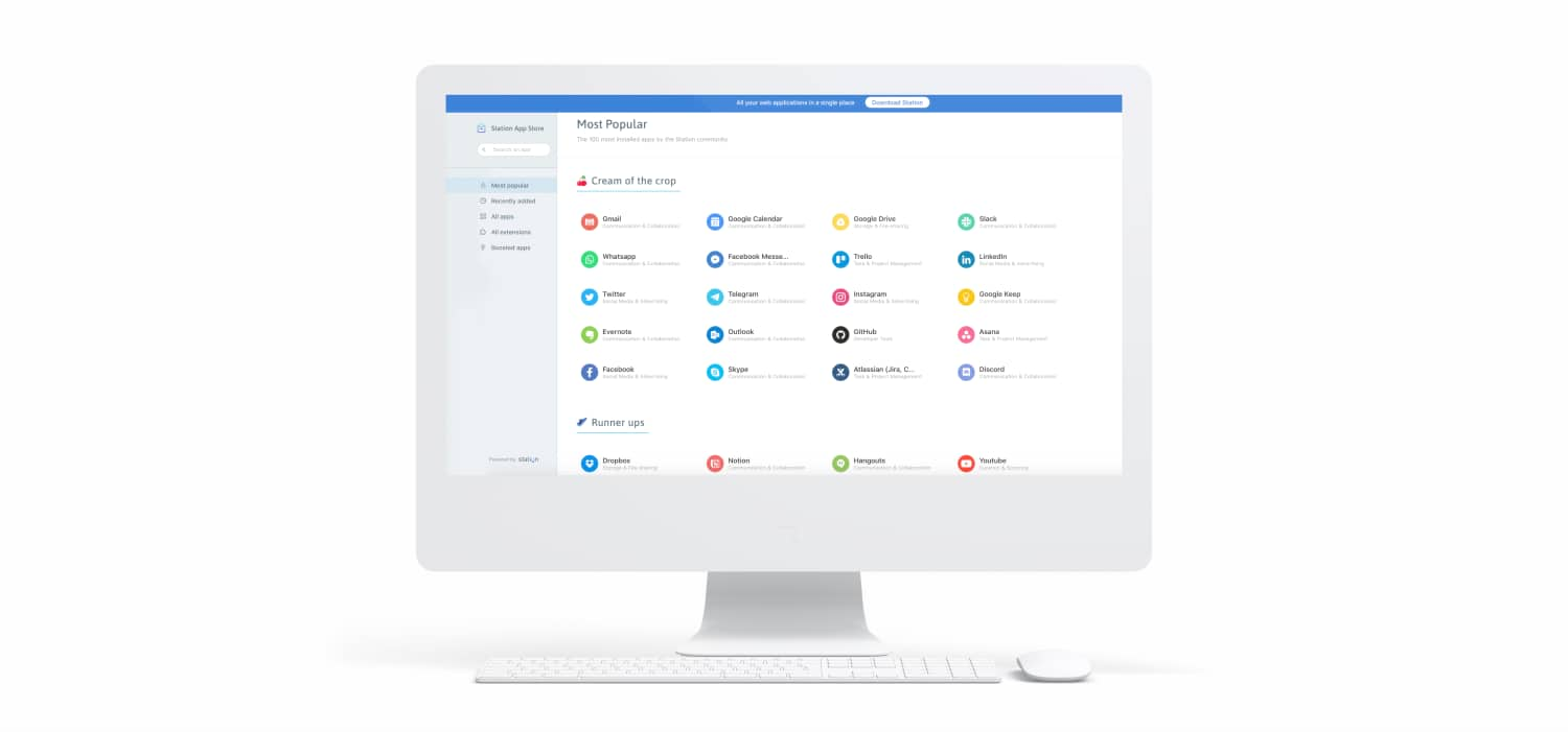
App Store allows you to have easy access to 400+ web apps which are sorted by categories and popularity.
The notification center gives the opportunity to disable notifications to avoid unwanted distractions without missing out on anything.
Business model. As was mentioned above, Station is a free of charge app. Since the team is committed to helping the users be more productive at work, for that reason the Station team does not plan on charging individual users. On the other hand, the team is planning charge companies starting in 2020.
Why is Station better than a traditional web browser for work? Station was designed from scratch with focus and efficiency in mind. The app benefits users in many ways, specifically:
Get rid of your tabs. All your work tools are neatly organized to avoid ending up with 20+ tabs stacking up on top of each other. Station was designed to keep even the messiest users organized throughout their workday.
Work faster. Since Station doesn't accumulate unnecessary tabs it also means that it runs faster than a classic browser. Only the apps you really need are loaded when you launch Station and it makes sure to save your memory to avoid slow down or crashes.
Stay focused. Station only offers work applications, therefore, it's impossible to be distracted by non-work related topics inside the app. It's your ultimate medium of focus.
Quickly find the content you need. Thanks to features like quick-switch or bookmarking, you can easily organize your most important pages and find them in the blink of an eye.
We asked the CEO of Station, Julien Berthomier, what was the inspiration to create such app and what are the scaling plan for the nearest future for the team and the product:
“We wanted to solve our own frustrations around finding information and accessing our work tools. Then we quickly realized after putting it into the hands of a few hundred users that we were not alone facing this problem. We were also inspired by tools like Franz that were among the first to build app aggregators.
(Regarding the scaling plan) Focus on providing value to entire teams by building a single source of truth about tools and SaaS apps in companies. On top, launching an SDK to allow any third party developer or SaaS editor to build deeper integrations between SaaS apps and the Station interface.”
Project idea: What are the Biggest Threats to Work Life Balance?
Time management is a crucial element of success no matter the niche you’re working at. Time is a huge value and the most important resource that should not be underestimated. Especially, time at the workplace. Each day from 9 to 6 you have got a myriad of different tasks, so to follow the schedule it is important to be productive and use the time wisely.
The average person spends 90,000 hours at work over a lifetime. Eighty-nine percent of employees waste at least some time at work every day. Thirty-one percent waste about 30 minutes, but the top 10 percent waste three or more hours each day. That extrapolates to more than 15 hours per week of wasted productivity, shedding light on the immense costs associated with poor time management.
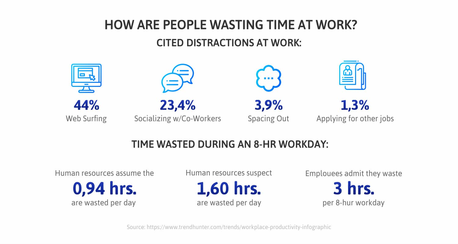
So, what gets in the way of getting things done? The recent survey examined how employees wasted their time at work. Workers were asked how much time per day they spend on tasks such as communication, meetings, researching for information. As a result, activities related to contacting customers, partners or colleagues were the most time-consuming.
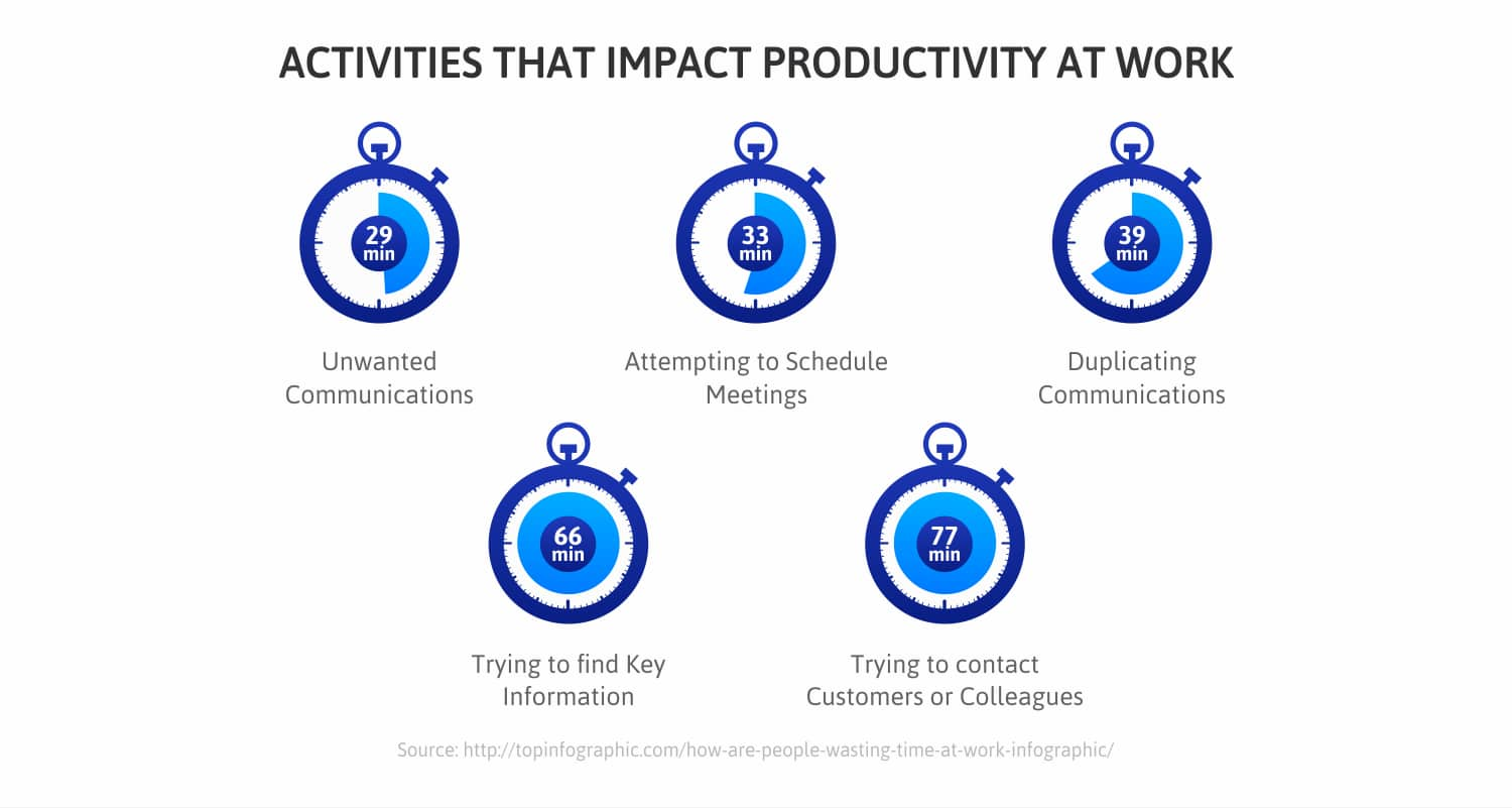
On the other hand, a huge time-consuming practice is working with a lot of different applications. Did you ever ask yourself how much time you spend checking out all your web apps every day? Surely, it takes ages to check the required accounts during the working hours. In fact, an average office employee spends around 1,5 hours simply by checking his working accounts and adjusting his web tabs for work.
Ask most people where they spend the majority of the day and you’ll hear email, Slack, or some other communication tool. When we looked at communication time across job titles we found that software developers spend, on average, 21% of their day on communication. While executives and product managers spend upwards of 37%.
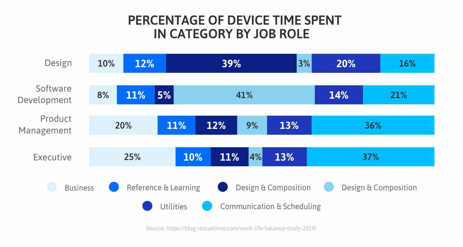
Surely, it’s not just the pure amount of time spent on a daily basis that killed our ability to focus. It’s the frequency we use these tools. For example, based on recent research, there were found that knowledge workers, on average, check email and Slack every 6 minutes (with 35.5% checking in every 3 minutes or less).
Most of us spend our days bouncing from task to task or trying to make up for a lost time by multitasking. On average, we use 56 different apps and websites a day and switch between them nearly 300 times.
It’s well established that multitasking is impossible for all but 1-2% of the population. And to do our best work, we need long stretches of focused time. Yet, 40% of knowledge workers never get more than 30 straight minutes of focused time in a workday.
Looking at multitasking with communication tools alone, most people on average spend 40.1% of their time during the workday multitasking. If we’re constantly switching our focus to check emails or Slack messages, we never have the chance to truly focus on our most important work.
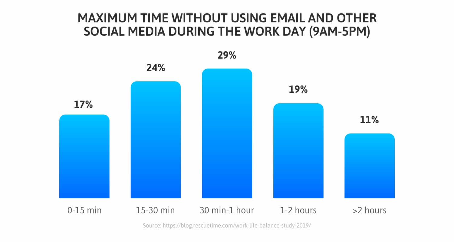
The workplace is filled with distractions. But some of the worst ones aren’t coworkers, meetings, or emails. But our own pull to distracting and unproductive activities. However, 21% of our device time during working hours is spent on entertainment, news, and social media.
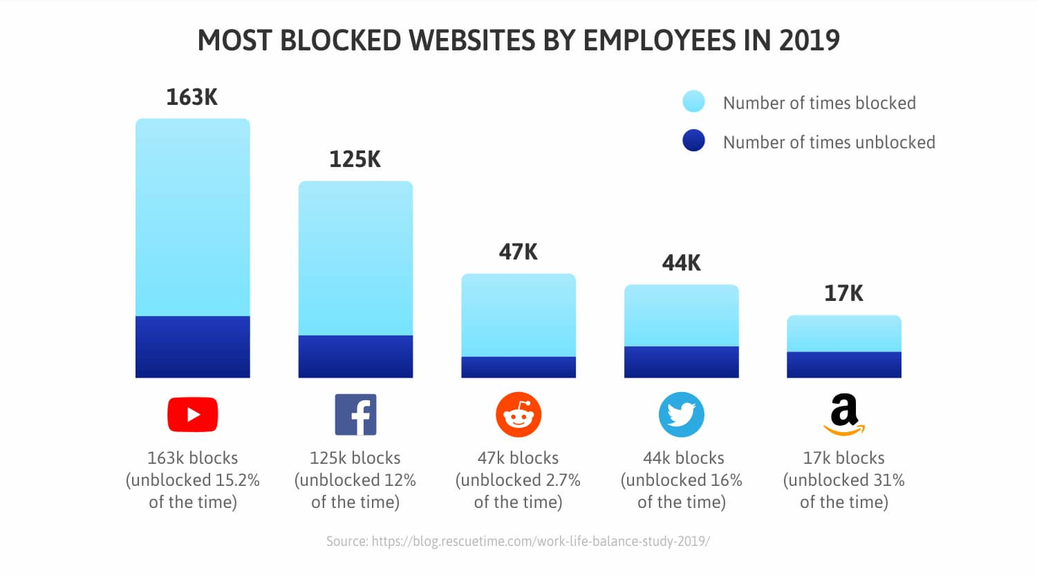
As you can see, quite often the allure of time-wasting activities (e.g. communication overload, checking work applications, finding the right tab or researching for suitable extensions) is just the main pitfall to completing tasks on time and the main threats to the work-life balance. When it happens, it’s up to modern technologies to keep everyone back on track.
How we built Station
As a web development company, we understand the importance of producing high-quality and scalable products. That is why we used the modern architectural decisions and React best practices to build a top-notch and innovative product on the SaaS market.
Making the SaaS platform we used technologies like Typescript, React (including Hooks), GraphQL, Node.js, PostgreSQL, React Router, React Virtualized, React Apollo, React Jss.
Code review. It was essential to ensure a native desktop experience. That is why a high-quality codebase was the first step to achieve. We did a secure source code review to be sure that the code was bug-free and nothing could affect the app’s work in the future. Moreover, our team improved the existing frontend codebase.
Caching GraphQL. For backend tasks, we changed the database structure. We switched from the default Redux store to GraphQL caching. So it allows reducing the interaction with custom data structures and uses advanced features like Optimistic response. Plus, this decision helps to lower server load which positively affects the overall app performance.
Data migration. To assure quick and easy organization processes between all user applications, we used Airtable. The service allows organizing anything and it works like a spreadsheet while offering the full power of a database. As a result, the data was migrated to Airtable to make the process of working with multiple apps smooth.
Frontend refactoring. The team entirely changes the client’s routing system - form the custom solution to React router (v5) with HashRouter. Along with that decision, we refactored the existing frontend architecture so the performance issues could be reduced.
Better UX and Complete redesign. As part of the user experience optimization, we had to be sure about high product usability. We also had to make sure that the visual representation of the app corresponds with the business logic. We improved UX with switching to GraphQL cache since it decreased the server load time and significantly increased performance. Plus, based on the best practices of UI app design our team created a new layout for the app and did a full redesign.
Adding new functionality. The functionality of this app went far beyond the scope of a basic software management tool. So, we had to include customized features to build a meaningful experience. We decided to add the correct application’s search functionality, infinite scroll, and edit/delete custom apps.
Technical optimization. We did not forget about the technical optimization of the app. We improved Google Lighthouse metrics which lead to a higher ranking on the search results and boost Station app visibility.
Project challenges
The main challenges of the project include:
#1 The initial task was to implement the onboarding process when the employer (on the vendor's servers) creates and manages ready-made sets of offers for his employees. The next step is to implement the onboarding process on the part of the employee when a new employee in a few clicks receives an already configured set of applications for work.
#2 The other task was to create a dynamic stepper (Stepper React component - Material-UI) that could be used in both linear and non-linear forms. In open form, each tab would represent a form for filling with different data, which would be regulated by the main Smart component.
#3 The final task was to implement of a table with the data of all onboardings in the system.
What was achieved?
The routing system has been redesigned and optimized using React Router v5, including hash routing if necessary;
Most of the components (previously implemented) were translated into React Hooks;
With the help of React Hooks, a fully typed Stepper was created with render optimization (React.UseCallback and React.useMemo Hooks);
The Stepper also supports a smooth system of steps (new steps may not appear at all until you complete the previous one). Linear and non-linear operating modes are involved here;
Routing was switched from working with the internal state to the React Router (it was one of the difficult issues in terms of architecture/performance).
What can be highlighted?
The whole mechanism of interactions between Steps (wrappers for the content of the stepper) and Stepper was invented (it was optimized in structure and was added the support for several modes). Additionally, it was made as a dumb component (customer requirement), so it can be reused quite conveniently.
All the functionality (logic) was implemented to create and edit Onboarding on the client (front-end), which managed data for Stepper.
Project launch
While Station combines all your messy web apps into a single app, the 2muchcoffee combined the best practices while building a SaaS platform. It’s fair to say that Station is a product of collaborative work between two teams - Station and 2muchcoffee.
The scope of our work included:
Code review
Caching GraphQL queries
Changing the database structure
Data migration to Airtable
Refactoring the existing front-end architecture
Implementation of a full redesign
Creating new layouts for the app
Extending the app functionality
Adding new functionality
Technical optimization
Development Process Details. As Station is the browser for work it was crucial to reach a native desktop experience- something that could be achieved due to high-quality codebase. Our team significantly improved the code. First of all, we made a code review to detect possible issues in the codebase which potentially could negatively affect the work of the app.
The back end tasks include caching GraphQL queries and changing the database structure (from services to applications). Additionally, the data was migrated to Airtable to make the process of an organization much easier.
Moreover, devs entirely refactored the existing front-end architecture. There was decided to switch to GraphQL cache instead of Redux as a main application’s Store. Such a decision provides huge benefits for the user-experience. There was implemented a full redesign by means of creating completely new layouts for the app. Additionally, our dev team extended the app functionality and added new ones, e.g. edit/delete of custom apps, infinite scroll, correct applications’ search functionality. Finally, Google Lighthouse metrics were improved to achieve better technical optimization.
Conclusion
Over the years, our browsers have evolved to become the central way of our lives. From working and shopping to reading/watching and sharing. Along the way, as billions of people were shifting to the browser as their main work tool, it started to show some weaknesses.
From the very inception, the Station team was focused on easing the user’s workday. As part of that, the team was trying to identify the small defects in the browser that could help to refine their product. The tactic was quite simple - one of the best ways to identify possible improvements in contemporary browsers is by looking at their most popular extensions.
As a result, the SaaS platform for web apps - the Station is a free desktop application that unifies all your work tools in one neat and productive interface. It is an alternative to your browser that's entirely dedicated to web applications you use at work, and that's designed to help you focus and get work done. It was a pleasure to work on such a project.
As a web development company, we understand the importance of producing robust and scalable products. That is why we used the modern architectural decisions and React best practices to build a top-notch and innovative product on the SaaS market.
